Look to industry professionals when determining the most popular interior paint colors, and you'll have a timeless color scheme for your home. Some of the best-selling hues and the most commonly requested colors for walls are the ones that designers and homeowners turn to time and time again. Fashionable colors come and go, so the most popular colors for interior paint are often those that transcend the changing trends and look timeless.
White Is Timelessly Elegant
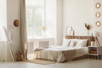
As the reigning champion of interior paint, white is a color that transcends both time and decorating styles. White can make a room feel bright, fresh and up-to-date in settings ranging from modern to traditional. Its understated elegance provides a blank canvas for decorating, allowing brightly colored accents to take center stage.
Classic White

A true, classic white is neither too warm nor too cool. It's the ideal white for a neutral interior, new builds, and homeowners who love to redecorate around a truly neutral canvas. Because the shade falls mostly in the middle of the temperature spectrum, classic whites are a go-to color for all the paint selections you feel unsure of.
White Dove from Benjamin Moore is a best-seller for the paint company and a go-to shade for interior walls, trim, and cabinetry. Most interior designers will tell you they've used this color on countless occasions, and it's always an ideal canvas for a stunning design project. This warm white with a slight hint of gray was also given an honorable mention by designer and blog author Luciana of Home Bunch and made the top 20 list of favorite white paint colors over at Laurel Bern Interiors. Also appearing on Benjamin Moore's own best-selling white paint colors list, White Dove is the go-to shade for interior walls or trim.
Warm White

Creamy, warm whites add a cozy vibe to your home while keeping the space open and bright. Create an inviting interior with a soft white that has subtle warmth and an obvious timeless quality.
Benjamin Moore's Swiss Coffee is the perfect creamy white that isn't too yellow or too tinged with brown. This shade of warm white almost carries its own little touch of sunshine for instant warmth in any room. Swiss Coffee has gained fans from both the design community and homeowners in the past few years because its timeless glow suits the current resurgence of warmth in home decor trends.
Cool White

Cool whites feel extra crisp, clean, and elegant. If you want a coastal-inspired space or an upscale interior, or you need to brighten up a low-lit room, cool white is the way to go. Stick to green-tinted or gray-tinted whites to avoid an icy blue undertone.
For a sleek, gray-tinged white, Decorator's White from Benjamin Moore has been a go-to for designers for years. This shade of white is crisp and sophisticated in a modern kitchen and brightens up a half bath with minimal effort. Pair this with other cool neutrals like gray and black or bring in blues or cool greens for a timeless pop of color.
Tips for Using Interior White Paint
White is one of the most popular colors for home interiors. Enhance your home with white by following these tips.
- White walls contrast beautifully with natural wood flooring and trim. The walls appear to recede, allowing the color and grain of the wood to stand out.
- Collections of framed art and photography have greater prominence when displayed against a white background.
- Use white paint to give dated brick or stone fireplace surrounds and walls a fresh, contemporary look.
- A monochromatic, all-white room places more emphasis on texture, form, and small details.
- Add interest to kitchen walls with bead board paneling and contrast white kitchen cabinets with antique bronze hardware.
- Sculptural shaped accessories and unusual profiles on furniture keep boredom at bay in an all-white space.
Beige Reflects Warmth and Comfort
Many designers and homeowners opt for the warmer tones of beige as a comfortable backdrop for interior walls. Beige is a classic paint color seeing an increase in recent years as trends are leaning toward warmer shades and cozier vibes. Beige is a go-to color for new builds and homes hitting the market because of its versatility, neutral quality, and familiar comfort.
Warm Beige

Warm beiges have red and yellow undertones and can even look green in certain lighting. You might see warm beiges used interchangeably with tan colors as well. Use these warm undertones to elevate the cozy vibes of your space and tie in that traditional and classic style that beige is so often associated with.
Balanced Beige has been a successful neutral for Sherwin Williams for quite some time because it's truly a neutral version of the sandy shade. Not too golden, too brown, or too green, this shade of beige is what neutral dreams are made of.
Greige

Beige has also taken a new direction, being combined with another popular neutral, the color gray. This new incarnation is called greige, and it's an interior designer's perfect blend of a warm color with a cool essence. Sherwin Williams created a greige worth grabbing time and time again with Accessible Beige, and it's a balanced compromise between cozy warmth and cool elegance.
More Great Beige Options
Ranging from light off-whites, to creamy caramels, to dark, muted browns, beige comes in a wide range of shades with varying undertones of yellow, green, and red. If traditional warm beige and trendy greige aren't quite your style, these other classic shades of beige might be what you're looking for.
- Sherwin Williams's Kilim Beige is warm and inviting without edging too close to tan. This shade of beige works well with deep wood tones and creamy whites.
- Glidden's Maybe Mushroom walks that fine line between cool and warm and does so in a classy way. With a versatile beige like this, you can work with any combination of cool or warm colors.
Tips for Using Beige Paint
Explore some of the best uses for the color beige in your home.
- If you're undecided between a cool or warm beige, lean toward a beige that looks a tad gray. This perfect balance will help you avoid walls that clash with other neutrals in the space.
- Accent beige with stark white or matte black for an updated and contrasting look. Shades of cream, almond, or off-white are perfect for the trim in a more traditional home.
- Try to avoid wood tones that are the same shade as your beige. Instead, contrast the medium hue color with deep shades of wood or light honey shades.
- Gray wood tones - like driftwood and white washed oaks - might clash with a warm beige, so opt for a grayer version of the color or swap out your wood tones.
Gray Is Clean & Sophisticated
Gray became white and beige's biggest competition in the 2010s and still captivates homeowners in the 2020s. Seasoned designers know that not every home is suited to the cool and icy color, but the ones that are truly sparkly in a coat of gray.
Blue & Green Grays

Shades of gray with blue and green undertones make a beautiful complement to the brown tones of wood and leather furnishings and the coastal design trends that are gaining popularity with homeowners. Sherwin-Williams's Magnetic Gray has just enough green to add warmth alongside wood tones, and Behr's Light French Gray has all the crisp, cool blue undertones to make a standard neutral feel like a beach getaway.
Dark Gray

Darker tones of gray add a sense of formality or make a dramatic statement on an accent wall. Dark gray makes a lovely backdrop for vintage furnishings and antiques, as well as streamlined and contemporary pieces. Charcoal grays have taken off in the past few years, almost surpassing the popularity of their light gray counterparts. Designer Lisa Mende shares excellent examples of charcoal gray paint colors, including Farrow & Ball's Down Pipe, which would work for these applications.
Light Gray

Light gray softens rooms with the feel of a light, cloudy mist or fog, perfect for a cooling effect in hot, southern climates or in rooms with southern exposure. Light gray also works well for adding color to the ceiling or providing a calm, relaxing atmosphere.
Sherwin-Williams's Essential Gray provides a clean, sophisticated backdrop to elegant interiors. This shade of gray is light enough to keep the space feeling open and airy while just dark enough to provide a lovely contrast against bright white trim.
Tips for Using Gray Paint
Make the most of your favorite shades of gray with the following expert tips on using this color in your home.
- Stick to flat and matte finishes for your gray paints. High gloss can make gray feel like a sheet of metal on your wall and leave the space with an industrial or commercial vibe.
- Choose cool and blue grays for rooms with a lot of sun exposure to help them feel more vibrant. Avoid these blues in low-light rooms so you aren't left with a dull canvas for your decor.
- Most grays will appear cooler once applied to your wall, so it's always a good idea to try a paint sample before committing to a color. If the gray looks slightly cool on the swatch, it could appear blue on your wall.
Blue Is a Tried and True Favorite
Blue is a beloved interior color and, depending on the shade and hue, can work in nearly any interior style. Reach for timeless blues for a home interior that feels curated and intentional as the years roll by.
Soft & Light Blues

Soft shades of blue find their place among traditional, coastal, and contemporary styles. Powdery blues are daring and bold on cabinetry, sensible on walls, and an absolute must for any home oasis.
Benjamin Moore's Dusky Blue is that perfect blend of soft and striking. It demands attention without feeling overpowering and can complement neutrals just as well as it pairs with bold accents.
Deep & Moody Blues

Since soft shades of blue are more popular, it might surprise you to find the timeless essence a deep, dark blue can have. Muddy, moody, and deep blues are classy for traditional homes and Americana style, but they also look sophisticated and regal in modern homes and eclectic styles. Just as you consider navy a neutral in the fashion world, it can also act as a dark neutral in your home.
Hale Navy from Benjamin Moore is a classic navy blue that's dark enough to suit a cozy living room, a regal primary bedroom, or a moody study. It's dark enough to feel like a neutral while sporting enough color to make an accent wall stand out.
Tips for Using Blue Paint
Follow expert advice on using the color blue in your home.
- When choosing between light blue colors, opt for dustier blues in traditional settings and more saturated blues for a modern pop of color.
- If navy feels too dark or dull, a bright cobalt blue adds punch while maintaining contrast with lighter details.
- If you want your light blues to be an obvious blue, make sure it doesn't look gray at first glance. Enough pigment is important for creating that bold blue look you're going for.
Greens Are Earthy & Elegant
Blue has been the longstanding classic for non-neutral paint colors. But green is well worth its weight in style, versatility, and impact. Grab an earthy, subtle green for a timeless twist on go-to neutrals.
Rich Olive Green

Olive green, much like navy, feels like a neutral in some spaces. A rich, golden olive green with depth and an earthy vibe brings life to any space in a timeless way. Reach for olive green when you want a sophisticated pop of color that's subtle enough to act as a backdrop for your more colorful accents.
Basque Green by Sherwin Williams has enough warmth to make your room feel lively and welcoming, while the depth of the color helps it settle into the background. Some olive greens have a brighter, more golden quality, while others are deeper and greener. The trick to a classic olive is to find that mossy balance between bold color and subtle depth.
Subtle Sage Green

If the golden hues of an olive green are too warm for your space or you want a green that's lighter while still feeling somewhat neutral, sage is the way to go. This shade of green has been a background player in interior design for a long time, and it's finally made its way to the list of truly timeless colors.
Juniper Breeze from Behr is a soft sage green that's powerful enough to carry an entire room's color palette. If you're daring enough, this subtle shade of green is stunning on cabinetry. Otherwise, use it in your living spaces and pair with neutrals like beige, cream, gray, and bright white.
Tips for Using Green Paint
Green might be a bit out of your comfort zone if you're usually drawn to neutrals, but these tips will help you feel at home with the color.
- Because of the yellow shades within a green paint, the color might often appear brighter once it's on the wall. When in doubt, go one shade lighter than the swatch.
- If you want to avoid a minty-green when you're searching for the perfect sage, grab a true green paint swatch and compare it to your would-be sage. If the green swatch makes the sage swatch look blue, try for a less saturated sage.
- Olive green can feel like it's boxing in a room when it's used in small spaces or on short walls. Extend the color onto the ceiling and trim to create the illusion of more space.
- Opt for a satin or semi-gloss finish if you want to make your olive green feel more modern, and stick to flats and mattes for a traditional take on the earthy shade.
Points Worth Remembering
While having one of the most popular interior paint colors on your walls is not all that important, color harmony is necessary for a pleasing palette. The key to a balanced look is to keep the saturation or intensity of each color the same. The lighting and surrounding colors in a room will always affect how any paint color looks on your walls. Use painted sample boards to try out colors in your home. Move them around the room, viewing the colors under different lighting conditions and comparing them against other colors, helping you zero in on the perfect shade, tint, or tone.
Design Your Palette With Popular Interior Paint Colors
An industry secret for many interior designers is that they often stick to what works when designing timeless spaces. That philosophy certainly applies to paint colors. If you want a home that grows with your family, style, and taste, these classic colors will never let you down.