
Give your home a calming and refreshing update with a rich teal color palette. A beautiful blend of blue and green, teal and turquoise are colors we recognize as pools of cool blue with a touch of warm green to make them rich, vibrant, and striking. Teal is generally darker while turquoise is lighter and brighter. Teal and turquoise are both a blue based color with just enough green to set them apart from cooler shades of blue and more yellow shades of green.
Update Your Home With a Teal Color Palette
The way you use your favorite shade of teal within the palette will determine the atmosphere it creates in your home. Be sure to consider factors such as lighting, other colors present in your home, and what rooms are best suited for this elegant shade of blue-green.
Bring Flare to Your Neutral Palette

An easy way to bring teal into your home is to add it to a neutral room. Light and warm neutrals like white and sandy beige are the perfect backdrop for introducing a few teal accents. Add teal in pillows, throws, rugs, and window treatments to a white and beige room.
Make It Monochromatic
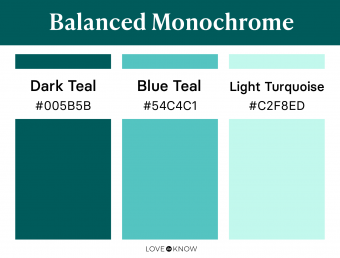
Attribution-Non Derivatives 4.0 International (CC BY-ND 4.0) Created by LoveToKnow Balance teal monochrome palette
Teal is a great color for creating a monochromatic color palette. Use varying shades of the same color to create the look. A teal-toned shade of navy, a true teal, and bright turquoise create a vibrant but balanced monochromatic teal color palette.
Add Depth With Dark Neutrals

Attribution-Non Derivatives 4.0 International (CC BY-ND 4.0) Created by LoveToKnow Dark neutral teal palette
A rich but dark teal can stand as your primary color when accented with sophisticated black and soft cream. The depth of the black and the dark teal create a beautiful contrast with cream. Try black accents that are sharp and cold like metal fixtures, hardware, and accessories. Then soften everything with creamy textiles like pillows, rugs, and blankets.
Curate a Colorful Palette

Teal and turquoise are excellent choices for a bright and vibrant color palette. Go all in on the vibrancy and select a bright green rich teal, mustard yellow, and a complementing coral for this color scheme. Use each color interchangeably throughout your decor for a color-rich palette that brightens your room at every turn.
Choose a Mix of Colorful and Muted Shades

Attribution-Non Derivatives 4.0 International (CC BY-ND 4.0) Created by LoveToKnow Muted mix teal palette
If the vibrancy of teal and its contrasting shades of red and orange feel too bright for your home, opt for a muted teal color palette instead. A slightly gray shade of teal complements warm and muted tones like rich rust and soft blush. These muted shades are a great way to use color without feeling overwhelmed by the contrasting vibrancy.
Bring Warmth to Neutrals
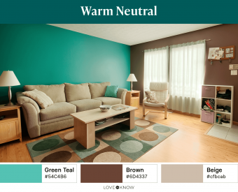
Warm neutral tones such as brown and beige create a cozy canvas for pops of rich teal. Let beige ground your room and keep things light while brown brings depth and teal adds the perfect shade of a rich blue-green to bring interest and color to the space.
Choose Rich Colors With Depth

Attribution-Non Derivatives 4.0 International (CC BY-ND 4.0) Created by LoveToKnow Rich deep teal palette
Using a dark shade of teal in your home decor may inspire you to consider other dark colors as well. Try creating a dark teal color palette that has plenty of rich colors. Combine deep turquoise with a rich moss green for a slightly monochromatic scheme and then throw in accents of a deep and dark fuchsia for a bold contrast.
Cool Down Light Neutrals

Attribution-Non Derivatives 4.0 International (CC BY-ND 4.0) Created by LoveToKnow Light neutral teal palette
If cooler shades suit your home best, a light shade of turquoise may fit in well. Surround this aqua color with plenty of cool gray and bright white so the space feels light and calming. Make sure the turquoise you select is more blue than green so you can accent all the cool shades in the color scheme.
Lighten and Brighten the Space

Attribution-Non Derivatives 4.0 International (CC BY-ND 4.0) Created by LoveToKnow Light & Bright teal palette
Go for bright and bold contrast with this teal color palette. Choose a bright teal or a light turquoise and complement it with a vibrant orange. Have plenty of creamy white in the backdrop to give this bright color palette some neutrality. If you choose a teal that is bluer, contrast it with a true orange shade. If the teal has more green, try accenting with coral for the perfect contrast.
Make It Moody With Light Muted Tones

A moody and muted color palette isn't just for darker or neutral tones. Ground this color palette with a deep olive, then bring in accents of turquoise and terracotta that are both slightly gray to make this a true muted color palette. Since all the shades are a muted color, you can use them interchangeably in paint, furniture, and decor.
Know Your Teal Options
Teal can seem like a difficult color to nail down because it's so versatile. However, there are just a few important color qualities that you need to know in order to find the shade of teal that works best for your home.
Every shade of teal has three qualities, each with its own spectrum:
- Level of blue vs. level of green
- Light vs. dark
- Bright vs. muted
Each of these qualities can fall anywhere on the spectrum to create a long list of teal or turquoise color possibilities. There are six popular teal and turquoise colors you will see most.

Attribution-Non Derivatives 4.0 International (CC BY-ND 4.0) Created by LoveToKnow Teal Shades
Blue-Teal
A shade of blue teal will be mostly blue with the slightest hint of green. It will appear entirely blue unless placed near a true shade of blue, demonstrating the presence of green.
Green-Teal
Green teal will have more warmth, but not as much warmth as a jade or emerald green. This teal will be obviously greener when compared to a true blue.
Light Turquoise
Light turquoise is usually a type of blue-teal that is light and soft. It will not appear too bright, nor will it contain too much green. Compared to a mint green, this should be softer and bluer.
Dark Teal
Dark teal is any teal that begins to cross over into a shade reminiscent of navy. It will still have hints of green, making it stand out from a true navy.
Bright Turquoise
Bright turquoise is similar in shade to a light turquoise, only it is more saturated with color and, therefore, brighter. You will notice a clear difference when compared to a muted shade or even a light shade of turquoise.
Muted Teal
Muted teal may be green-teal or blue-teal. The defining characteristic of this shade is the presence of gray. A hint of gray will deplete this color of most of its brightness and saturation and leave it feeling muddier than a bright turquoise.
Teal Can Work With Many Palettes
Because teal can fall anywhere on a large spectrum, it's actually a color that's very easy to work with. The presence of cool and warm tones makes it great for complementing nearly all other colors. The bright and muted spectrum means it can work with your style if you prefer vibrant accents or a moody atmosphere. Once you find the right teal or turquoise for your style, you will see just how easily this blue-green hue fits into your home's color palette.


