If you're looking to bring a cozy and welcoming vibe to your home, a warm color palette for your interior may be just the thing for you. Warm color palettes do not have to be full of bright reds and shocking yellows. Rather, you can create a comfy atmosphere with warm tones of nearly any shade. Whether your preference is bold and vibrant, strictly neutral, dark and moody, or subtle and muted, there's a warm color palette that's perfect for you.
Creating Warm Color Palettes
Warm color palettes can be strictly warm, contain some cool colors, or even be full of neutral colors. Be sure to consider how warm colors work with certain design styles. Most design styles can easily work with some amount of warm colors.
Warm Neutrals

A great place to start with a warm color palette is to combine two warm neutral colors. Use beige as your primary color with plenty of brown to ground the space and add depth. For accent, try warm shades like maroon, mustard, or coral.
Warm Monochrome

Try a slightly monochromatic color palette with warm colors. Combine muted rust with bright pops of coral throughout for a bit of vibrancy and fun. Ground this color palette by adding touches of warm brown.
Warm Contrast

Play with contrast inside of a warm color palette by adding a color that can be both warm and contrasting like teal. Because of the blue and green present in teal, it's mostly cool, but the green gives it a slight and subtle warmth. Use this alongside a base of cream and plenty of rust to create beautiful contrast in your warm color palette.
Light & Neutral

If you love a light and neutral color scheme, try a light warm color palette. Combine favorite neutrals like cream, tan, and beige for a space that feels cozy but not weighed down by deep or bright colors.
Neutral Contrast
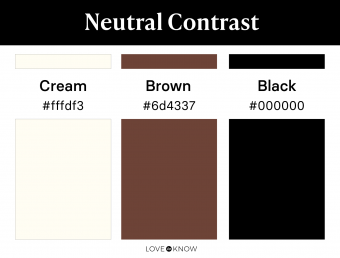
If you want more depth in a light neutral space, try adding a bit of brown or black to your warm color palette to ground your space. Black and brown both work well in accents like light fixtures, drawer pulls, furniture, and window treatment hardware. Combining black and brown in a space can help the warmth stand out as black gives depth, but the brown helps your space feel inviting and cozy.
Warm & Traditional
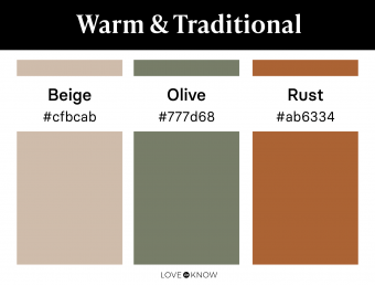
Using a warm color palette doesn't necessarily mean you have to forget about traditionally cool colors like green. Choose a muted, deep olive green for your palette's accent color. Olive has plenty of warmth that helps it complement a warm beige and a rusty orange. This muted color palette is also versatile because it works well with traditional and modern decor alike.
Dark & Neutral
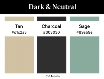
Colors like charcoal and sage are often considered cool. However, when combined with a warm tan, you can easily incorporate these shades into your warm color palette. Choose a deep sage that doesn't have too much blue and use it alongside a charcoal that feels a bit warm. These colors come together for a neutral and dark warm color palette.
Deep & Vibrant

Create a contrasting warm color palette that has depth and vibrancy. Use a warm shade of off-white as your primary palette color. Ground the space with a deep navy. Because navy is generally a cool color, it contrasts beautifully near a bright and warm coral. Choose a coral that is more orange than pink to really play up the contrast of warm and cool.
Deep & Warm

Try a deep and saturated color palette with enough warmth to make it cozy. Combine a warm tan with a true shade of olive. Tan works well in textiles, leather furniture, and wood accents. Olive, though still warm, provides a very subtle contrast. Add touches of black throughout for depth.
Bold & Warm

Go bold and vibrant with this warm color palette. Red is very warm and feels extra fun alongside a bright pink. Accents of black add depth and subtle contrast to these warm and vibrant shades. If these bold colors feel like too much in large concentrations, try using each as accents in a neutral room.
Traditional Monochrome

This monochromatic color palette uses traditionally warm shades that are timeless and comforting. Combine rust, red, and brown for a classically warm palette that is monochromatic and welcoming. Use each shade interchangeably in your decor, wall colors, and furniture for a truly monochromatic look.
Warm & Rich

Try a warm, rich color palette that is full of autumn inspired colors. Complement a vibrant shade of plum with rusty orange and gold accents. All these colors are warm in tone, but the colors themselves create a bold contrast that still feels cohesive.
Warm Greens

This monochromatic color palette contains plenty of warm greens, so your space still feels cozy and inviting. These varying shades of green bring nearly every color aspect into play in your room. Olive acts as a deep and grounding neutral. Moss green brings saturation and vibrancy as an accent. Ground the palette with a complementing tan.
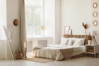
Light & Cozy
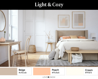
A light color palette with a touch of subtle color is perfect for a cozy living space. Neutrals like warm beige and creamy white act as the perfect backdrop to a soft and subtle peach. Mix in wood details for depth and plenty of soft textiles to amp up the cozy vibes.
Soft & Subtle

A combo of warm brown shades can give your room plenty of warmth in a subtle way. A deep brown and a soft beige act as your neutral colors, while a fun blush brings additional warmth and a touch of color. Be sure to keep the palette warm by selecting a true shade of blush without any hints of lilac.
Bright Contrast
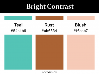
A warm and bright color palette that has nice contrast? Look no further than this trio of warm colors. Choose a teal that isn't too blue and ground it with a muted rust. Hints of blush throughout give this color palette more warmth and a bit of softness. If this color palette feels too colorful for your style, try using it against a canvas of warm neutral colors like cream, beige, or ivory.
Versatile Neutrals

Gray is a versatile color, so it's no surprise that it continues to be extremely popular. If you want to use gray in your warm color palette, go slightly warmer than a true gray and choose a brown-based greige. This color was born from a beige and gray combination, and it looks warm and inviting next to cream and brown accents.
Warm Pastels

Try a warm color palette that is light and subtle by using a muted sage with a pale yellow. These colors may not look obviously warm, but they have warm undertones that complement a creamy white. Combine these three soft colors for a warm light color palette that's comforting and calming.
Traditional & Timeless

Try a traditional color palette that's warm and neutral for a timeless look. A warm beige and a rich brown are inviting neutrals for a living room or dining area. Accent with black details for depth. Use black in your metal accents like light fixtures and brown in leather details for an updated and modern look.
Subtle & Versatile

Keeping things neutral, this color palette offers subtle warmth and versatility of style. A true shade of brown is already fairly warm, but using it alongside a warm shade of green like olive elevates the warmth even more for a cozy vibe. Hints of cream give a light accent throughout and keep this palette from feeling too dark.
Subtle & Muted

This muted color palette is still warm, but not in an obvious way. Soft shades of blush and rich brown keep this palette feeling warm, though it is muted. Rust adds subtle color that helps this palette feel elevated and refined.
Earthy Tones

This trio of colors is not overly warm at first glance, but the subtle warm tones in each color help create a dark color palette. Choose a dark gray like charcoal and warm things up with a grounding neutral like greige and a warm but subtle color like olive.
Timeless Neutrals
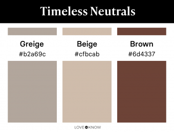
Greige is a gray with a brown undertone, so it can complement warmer neutrals like beige and brown. Use these neutrals interchangeably, choosing to focus on the darker or lighter shades based on your own preferences. In any amount, these neutrals come together for a timeless look.
Muted Mix

Warm muted shades can feel exciting and inspiring when paired correctly. Mix warm muted tones for an updated take on a colorful warm palette. Muddy sage and rust pair well with charcoal for a subtle look that still has plenty of color.
How to Tell if a Color Is Warm
Warm and cool undertones are terms mentioned often in interior design, and they may sound confusing at first. Can there be such a thing as a cool pink? Is it possible for gray to have a warm undertone? Once you understand the terminology, you can answer these questions and find out if warm tones have the qualities you're looking for in a home's interior color palette.
A color is considered warm in tone if there is any presence of yellow. For certain colors, this yellow presence may appear more orange, brown, or red due to other colors combining with the yellow undertone. Applying this principle, you might find that a gray with a slight brown undertone would be considered warm. A shade of green that appears to have more yellow than blue would be a warm shade of green. A purple that looks a bit of red would be considered warm as well.
A great way to think of the scale of temperature for a color is to start with red. A true red is perfectly neutral in terms of temperature. However, if that red starts to move toward orange, it's considered warm. If the red moves toward purple, it's considered cool. Keep in mind that some colors contain both warm and cool undertones. In these cases, the dominating tone will determine the temperature of the color.
Bring Warmth to Your Home With the Perfect Palette
The key to a warm color scheme is to build a palette that's warm enough to create a cozy and inviting space but isn't overwhelming from using an abundance of bright or warm colors. Use neutrals, metal accents, cool undertones, and muted colors as needed to help your warm color palette feel like it was custom created by a designer specifically for your home.